Darja Karina Baranova
Personal Art Portfolio (demo)
Advertising Typography
"Spirits & Wine"
This project shows some graphics for advertising typography advertising within the "Sprits & Wine" brand.
"Spirits & Wine" is an alcohol mass-market trader. Flyers and banners were developed based on the brand book. This project exposes graphic composition, information hierarchy, and UX skills.
A small flyer is a good composition challenge: place plenty of information on a small piece of paper, but the information should stay easily understandable. Also, a large banner should transfer the right information even from a far distance, and have minimum information and details.

The main task of this work was to create advertising typographic materials for the store, save the brand's unique style, and use mostly brand colors and fonts. The main feature is a simple solid color background, white text, and specific font for headers and paragraphs.
Fonts:
Formula Condensed Bold
Formula Condensed Light
#FFFFFF
#E1251B
#00000D
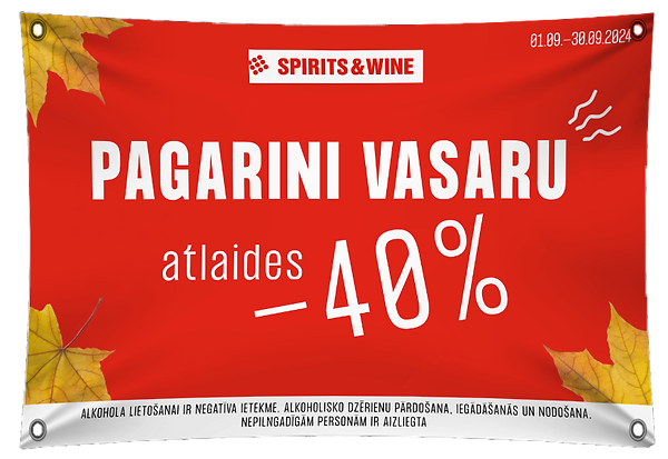
A1 format banner

A1 format banner

Hierarchy
The large font size for the hedder, smaller for under hedder, and small and thiner for the rest.
Header 1
Header 2
Paragraph
Contrast
Bright red and clear white easily draw attention. No gradients, to leave the image clearer. The gray color of the map highlights the red spots of the store's location.
Composition
Elements (header, map, and store work hours) have the same spacing. It makes the picture look more appealing and neat.
User-Friendly Design
The work hours of the brand's stores on particular days are very different. In this case, to make the information look more user-friendly, I used special graphics.
A5 format flyer


Softwares

Photoshop
Figma